 |
|


 Sep 27, 2008, 08:05 AM // 08:05
|
#1 |
|
Forge Runner
Join Date: Nov 2006
Location: Arizona, USA
Guild: [OOP] Order of the Phoenix I
|
 A GW Halloween wallpaper
Well, this thread brought to the forefront my fervent obsession with Halloween, my most favoritest of all holidays.
As always, constructive critiques are highly appreciated. I'm planning to enter this for the GW Halloween Art Contest so be brutal if you feel like it.  Mini version for those that don't like to open anonymous links; 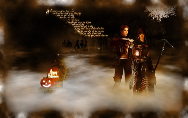 And full sized, UPDATED, 1680x1050 image; http://i36.photobucket.com/albums/e4...llpaper-08.jpg The woods in the background are a composite of the forest in the Charr lands, outside Doomlore if I remember correctly. The pumpkins I think I found on a craft site three years ago, and the hay bales were a 2D image I found, which I formed into a 3D-ish looking hay bale shape. And also my characters. There isn't much of a story behind the image, just my characters going for a moonlit stroll amongst a creepy, foggy forest where someone has artfully placed a nice arrangement of hay bales and Jack'O'Lanterns. Thanks for looking! Last edited by Operative 14; Oct 01, 2008 at 02:42 AM // 02:42.. |

|

|
|
Sep 27, 2008, 09:43 AM // 09:43
|
#2 |
|
Frost Gate Guardian
Join Date: Feb 2007
|
That looks amazing!
~Lies |
|
|
|
|
Sep 27, 2008, 10:05 AM // 10:05
|
#3 |
|
Academy Page
Join Date: Aug 2008
Location: Italy
Guild: LOTF
Profession: Mo/
|
probably too much contrast on the ele's face, it seems very unnatural imho. As a suggestion, you should make the fog more "foggy" at the dervish's feet creating some more waves on it.
good work anyway
|
|
|
|
|
Sep 27, 2008, 10:27 AM // 10:27
|
#4 |
|
Lion's Arch Merchant
Join Date: Mar 2008
Guild: We Bought Plan C On [Ebay]
Profession: W/E
|
i would take away that Characters in The backround. they just seem out of place.
and the abovue Suggestion about the feet too. but good job none the less. |
|
|
|
|
Sep 27, 2008, 12:17 PM // 12:17
|
#5 |
|
WTB q8 15^50 Weapons!
Join Date: Nov 2006
Guild: アoo アugs アlan [ァアァ]
|
Awesome picture!
|
|
|
|
|
Sep 27, 2008, 02:42 PM // 14:42
|
#6 |
|
Jungle Guide
Join Date: Feb 2008
Guild: Aura
Profession: Mo/R
|
no mad king thorn?
 This is MADNESS! This is MADNESS!good pic anyhow~ |
|
|
|
|
Sep 27, 2008, 03:18 PM // 15:18
|
#7 |
|
Forge Runner
Join Date: Mar 2006
Location: Mableton, Georgia
Guild: Guild Ancestors Reunited [ギルド]
|
hmm not good but not bad. 5/10.
the forground ele has too many jaggies in his armor. maybe take another screen of him and (assuming you have an nVidia video card) turn your settings to "enhance application" and set your anti-aliasing to x32Q? that 'should' fix it. |
|
|
|
|
Sep 28, 2008, 12:02 AM // 00:02
|
#8 | |
|
Forge Runner
Join Date: Nov 2006
Location: Arizona, USA
Guild: [OOP] Order of the Phoenix I
|
Thanks at the above comments.
Quote:
And doing that should also afford me an opportunity to fix the contrast issue on the face that liutpry brought up, and necessitate remaking the fog layer which should fix the other issue he had.  And @ Rothan, I thought the poem for Mad King Thorn was enough.
|
|
|
|
|
|
Sep 28, 2008, 01:22 AM // 01:22
|
#9 |
|
Forge Runner
Join Date: Mar 2006
Location: Mableton, Georgia
Guild: Guild Ancestors Reunited [ギルド]
|
heh yea. i like the pic, don't get me wrong, i just pay EXTREME attention to details and i am a little bit of a perfecitonist so something as little as jaggies will make a pictures value go down in my eyes. nice job though either way :P
|
|
|
|
|
Sep 28, 2008, 01:27 AM // 01:27
|
#10 |
|
Frost Gate Guardian
Join Date: Apr 2007
Location: England,UK
Profession: R/Me
|
I like It, i like how youve put the shadows of other characters in the background. A improvement would be to add some more colour, i know its halloween and its suppost to be gloomy, but some colour would be nice so its more interesting to look at. I'm not picking faults with it or anything

|
|
|
|
|
Sep 28, 2008, 06:52 PM // 18:52
|
#11 | |
|
Forge Runner
Join Date: Nov 2006
Location: Arizona, USA
Guild: [OOP] Order of the Phoenix I
|
Quote:
I was working on it for a while when I first posted this so I had trouble looking at it objectively. After coming back to it the next day, and also reading your comment, it popped out at me as well. To be honest, I think this was the first time I used these characters as a full size render when resizing them or erasing a good portion of them didn't alleviate the issue automatically. And as far as colors go, you're quite possibly right, Liam. I think I'll play with that aspect a bit more.
|
|
|
|
|
|
Sep 29, 2008, 02:01 AM // 02:01
|
#12 |
|
Krytan Explorer
Join Date: May 2006
Location: Halfway between here and there
Guild: Advanced Technology [CCCP]
|
Just a little nit-pick. The light on the ele's face doesn't seem to be coming from the proper angle. He's holding the lantern below chest level, but the light seems to be coming from above chest level.
|
|
|
|
|
Sep 30, 2008, 01:17 AM // 01:17
|
#13 |
|
Jungle Guide
Join Date: Apr 2006
Location: California, USA
Guild: Vulpes Velox [Fox]
Profession: Me/
|
I love the way you do the manips on all your wallpapers, most of (note, I didn't say all) of the guild wars wallpapers involving screens end up looking like the person just got Photoshop and is going through the filters stage. Yours are excellent however, I love them!
|
|
|
|
|
Sep 30, 2008, 05:20 AM // 05:20
|
#14 |
|
Forge Runner
Join Date: Nov 2006
Location: Arizona, USA
Guild: [OOP] Order of the Phoenix I
|
Thank you Mr. Sea.
And @ Senrath; I changed out the Ele as per the earlier suggestions, I think that - sort of - fixed the issue you rightfully brought up. You are very right though, in that early take the lantern light was very off kilter according to my Ele's positioning. Here's the newest take on it (I'll update the OP as well). New Version |
|
|
|
|
Sep 30, 2008, 06:25 AM // 06:25
|
#15 |
|
Jungle Guide
Join Date: Apr 2006
Location: California, USA
Guild: Vulpes Velox [Fox]
Profession: Me/
|
You mean Mrs. Or Ms, to be exact xD. New link goes to a forum that says you have to be logged in in order to see it.
|
|
|
|
|
Sep 30, 2008, 11:44 AM // 11:44
|
#16 |
|
Furnace Stoker
Join Date: Jul 2006
Location: behind you
Guild: bumble bee
Profession: E/
|
placing of the pumpkin and the two prominent character are too "balance" like you measure out how many inch left side and how many inch right side, make the whole thing look dull (layout wise)
color wise highly saturated pictures has its beauty but not in this case. seems like you are lacking something that i cannot pin point. background silhouette is too "unseeable" that you can do without them, so if you don't want it to be seen why put it there, and if you want a silhouette then why make it unseen? wordings/ poems? are unreadable. and how you layout the text makes the whole pictures look lopsided . Last edited by pumpkin pie; Sep 30, 2008 at 11:46 AM // 11:46.. |
|
|
|
|
Sep 30, 2008, 06:57 PM // 18:57
|
#17 |
|
Frost Gate Guardian
Join Date: Nov 2006
Profession: E/Me
|
not bad not bad at all
|
|
|
|
|
Oct 01, 2008, 02:27 AM // 02:27
|
#18 | |
|
Forge Runner
Join Date: Nov 2006
Location: Arizona, USA
Guild: [OOP] Order of the Phoenix I
|
Quote:
And Pumpkin; you're just picky. Seriously though, you're right. I was kind of gambling with the hay bales and the pumpkins, because they don't really fit in with the scene that much. I do think they add a bit of something that was missing however. The silhouettes... I was kind of thinking that they fit because they're the other characters kind of standing in the background being a bit wraith like. They sort of add a spooky element that is otherwise missing, or understated. The Poem is a bit hard to read, you're right, but I can pretty easily read it at full resolution. And the saturation I completely agree with you; I did correct that a bit in the updated version (see link below). Probably not as much as I should have however. http://i36.photobucket.com/albums/e4...llpaper-08.jpg Last edited by Operative 14; Oct 01, 2008 at 02:43 AM // 02:43.. |
|
|
|
|

|
Oct 07, 2008, 01:46 AM // 01:46
|
#19 |
|
Ascalonian Squire
Join Date: Dec 2007
Location: I live in my room
Guild: Knightwolves Of The North [WOLF]
Profession: E/Mo
|
i like it
sorry though, im no good at critiquing because i always think everything looks great. haha. but i think its much cooler than the wallpaper that won something in last year's contest. hope you win!
|
|
|
|
|
Oct 07, 2008, 03:35 AM // 03:35
|
#20 |
|
Krytan Explorer
Join Date: Oct 2005
|
Don't suppose you could resize that to 1280x800? :X
Last edited by Demonstar; Oct 07, 2008 at 03:38 AM // 03:38.. |
|
|
|
 |
|

«
Previous Thread
|
Next Thread
»
| Thread Tools | |
| Display Modes | |


 Linear Mode

|
|

 Similar Threads
|
||||
| Thread | Thread Starter | Forum | Replies | Last Post |
| GW WallPaper | FossilGW | Nolani Academy of Arts | 2 | Jan 18, 2007 08:19 PM // 20:19 |
| Halloween Wallpaper | Midnight Harmony | Nolani Academy of Arts | 4 | Oct 24, 2006 04:02 AM // 04:02 |
| Josh | Off-Topic & the Absurd | 11 | Dec 28, 2005 03:37 AM // 03:37 | |
| Another GW Wallpaper | R F O X | Nolani Academy of Arts | 16 | Dec 14, 2005 05:33 PM // 17:33 |
| POurab | Nolani Academy of Arts | 24 | Sep 18, 2005 12:11 PM // 12:11 | |
All times are GMT. The time now is 09:06 AM // 09:06.
